“An architecture in continuous motion is not utopian… if you consider the normal perception of today’s individual, accustomed to current modes of transportation, television and fast-moving information, this perception is a mutable and dynamic one.”
Maurizio Sacripanti
If you missed the first introductory article about Maurizio Sacripanti, you can find it here.
In 1968 Sacripanti and his team joined the competition to design the Italian pavilion for the Universal Exposition of 1970 in Osaka. He proposed the idea of a space in perpetual motion, a living organism, experimental and courageous, which clearly differed from the other competing projects. This proposal was aimed at the promotion of the messages and contents that were supposed to represent the Italian values of the time. His idea of Italy was clear: “a reality in motion, amidst a thousand difficulties, and with a thousand obstacles, but with a commitment to vital and continuous dynamism” [1].
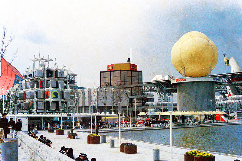
(commons.wikimedia.org/wiki/File:Osaka_Expo%2770_Kodak%2BRicoh_Pavilion.jpg)
In the report that accompanied the project, Sacripanti and his team underlined how international exhibitions are always opportunities for experimentation. Citing the pavilions designed by Mies van der Rohe in Barcelona in 1929 and by Alvar Aalto in New York in 1939, reference is made to an unprejudiced inventiveness that is rich in directions and cues for the future. But above all, Sacripanti emphasized how these pavilions were capable of conveying intrinsically new ways to enjoy the architectural space.
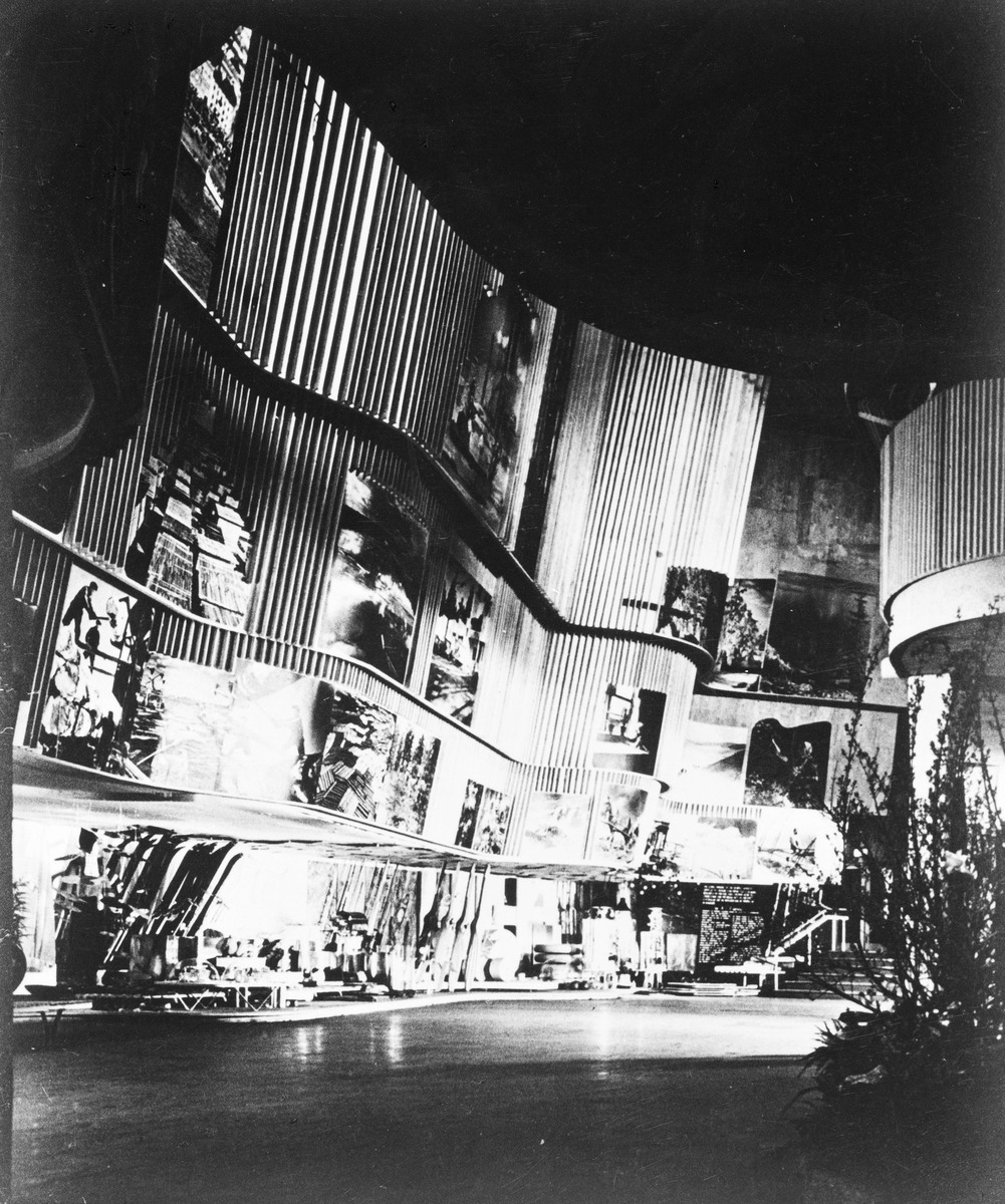
Here this became, for Sacripanti himself, the goal of the project: to find an absolutely contemporary way of living in the architecture, and “to use time as an effective parameter, […] as an architectural medium like any other” [2].
The idea of a kinetic space, albeit in a controlled manner, was in his opinion a completely open and technologically feasible field, ready to be explored through an experimental and iconic construction.
“The task of the architect is to master technology and make it language.”
Maurizio Sacripanti
Another important reason behind the dynamic features of the pavilion was the exploration and understanding of the “perceptual parameters that a mutable space necessarily involves” [3], a constant topic in the artistic language from cubism and futurism onward. Here Sacripanti synthetized its link to the art of that historical moment, in particular the kinetic and programmed art, believing that the time had come to bring its principles into architecture.
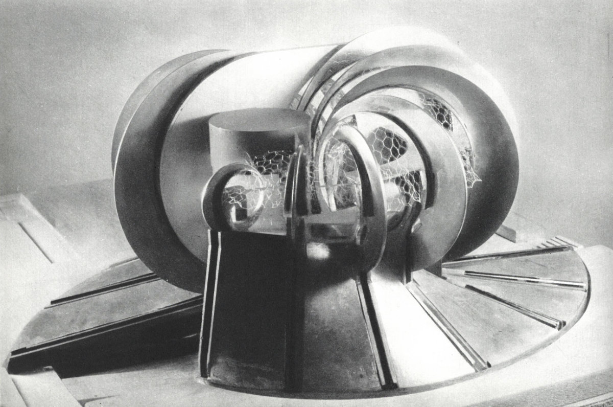
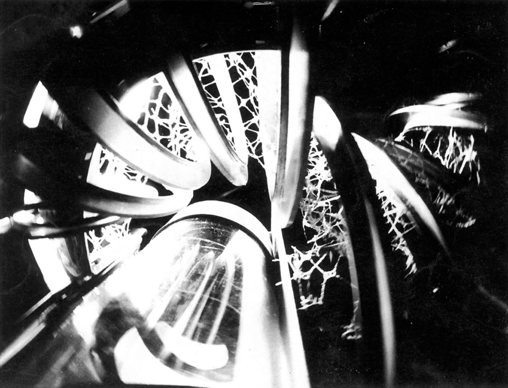
Sacripanti has masterfully managed to translate these concepts into his design proposal. The composition of the pavilion, symmetrically reversed, provides a double set of seven blades, innovative bricks, and a unit of measurement for the mobile space: vertical rings generated by two eccentric circumferences, having progressive and growing dimensions and capable of swinging on pivots through a pneumatic system. Inside the blades are placed two curved and suspended exhibition floors. Between the blades is interposed an elastic membrane – a mantle – having a pictorial pattern and capable of covering the exhibition space and adapting itself to the movements of the blades. The mantle contributed to spatial variations, strengthened by the lighting component which is both natural and artificial. This description should not be deceptive: in the project for Osaka the technology is admittedly a medium, not a purpose – it serves to make this architecture a living fact.
“An architecture cannot resemble a piston or a rod, and it cannot make its motion cyclical: an architecture in motion should be a living fact.”
Maurizio Sacripanti
The swinging of the fourteen blades, combined with the adaptability of the mantle, should have simulated the inhalation and exhalation of an animal, giving birth to a breathing pavilion. The movement of each blade – researched with the then young engineer Maurizio Dècina – was indeed independent of the others. This ensured a combinatory and never equal movement so that the entire system would never repeat the same combination during the Expo, thus determining infinite spatial modification and perceptions through a controlled unpredictability. Moreover, the technical report clearly described that the movement of the blades could also be modified according to movements of the visitors, through the insertion of motion sensors. This anticipates the idea of interaction between space, technology and user, which was not yet a topic in architecture projects.
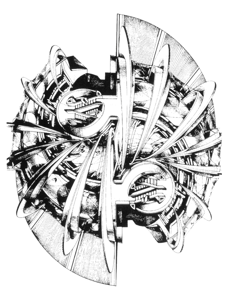
We do not have precise information about what the design process was, but we believe that the prevailing vision of the designer was the one from the inside of the pavilion, geometric explication of the modes in which Sacripanti wanted the space to live and travel through time.
The generative power of the pavilion starts then from the inside – represented by the experience you want the user to live – and this effect then impacts the outside of the pavilion. The blades, showing their motion, are an invitation – a call to live in the space as protagonists.
Unfortunately, despite the technological and architectural innovation, Sacripanti did not win the competition. The winning project was designed by the firm Studio Valle in collaboration with Sergio Musmeci, who oversaw the structural design.
It’s a shame, a missed opportunity.
We say that because today, after entering the pavilion and admiring the blades in motion, we are confident that Sacripanti was clear about every detail of that dynamic architecture, nothing was left to chance. And indeed, in the last part of the technical report, he gave a summary, talking as if he had already crossed that space and explored it from the inside, as if his eyes had already seen it. In his mind the Osaka pavilion was already built.
“Inside the blades are placed two exhibition floors… from every point of these floors, the vision of the inner space changes continuously, encompassing a very rich panorama of shapes and movements: the inner face of the movable membranes, the blades themselves that determine their own structure in motion, and the internal vacuum between them, animated by the movement of those of the opposite series… the suggestiveness and the spatial poignancy of a system like this can, in our opinion, become so strong that the problem appears rather to be that of limiting and controlling them, so as not to subject the visitor to an excessive shock.”
Maurizio Sacripanti
Our journey about Maurizio Sacripanti and the Osaka experience continues here, with the interview to Prof. Maurizio Dècina, the engineer who designed the motion system of the Osaka pavilion.
The sentences quoted in the articles come from the original report of the competition, kindly provided to us by the Prof. Maurizio Dècina and signed by the design team.
Design team of the Italian Pavilion for the Osaka Expo of 1970: Architect Maurizio Sacripanti, Architect Andrea Nonis, Engineer Maurizio Decina – automations, Engineer Giulio Perucchini – structures
Collaborators: Achille Perilli, Renato Pedio, Architect Sandro Latini, Architect Giancarlo Leoncilli
[1] Translation by the authors. Original Text: “[…] una realtà in moto, tra mille difficoltà e con mille ostacoli, ma in un impegno di vitale, continuo dinamismo”, Sacripanti M., from “Domus”, 473, 1969
[2] Translation by the authors. Original Text: “[…] usare il tempo come parametro effettivo, […] come mezzo architettonico al pari degli altri”, Sacripanti M., from “Domus”, 473, 1969
[3] Translation by the authors. Original Text: “[…] i parametri percettivi che uno spazio mutante necessariamente comporta”, Sacripanti M., from “Domus”, 473, 1969
Cover image
Model of the Osaka Pavilion designed by Maurizio Sacripanti, 1968
Rome, Accademia Nazionale di San Luca, Fondo Maurizio Sacripanti, www.fondosacripanti.org